Itacate Food Delivery App
Bringing Authentic Flavour to Digital Ordering
UX/UI Design · Branding · Prototype
Overview
Designing warmth, simplicity, and authenticity for a local taquería’s digital future.
A bilingual food ordering prototype designed to bring the heart of a small taquería online.
Itacate was built to reflect the warmth, colour, and authenticity of Mexican cuisine while improving order efficiency for busy customers. Designed for mobile use, the project explored how a small restaurant could offer a more direct and personal ordering experience without relying solely on third-party delivery platforms.
Challenge
Itacate began accepting orders through Uber Eats, SkipTheDishes, and DoorDash to supplement its income, but the high commission fees and lack of brand control reduced its profit margins and visibility.
The challenge was to design a dedicated ordering app that offered independence, efficiency, and a cohesive brand experience, all while keeping the interface clear and culturally authentic.
Key objectives:
Simplify the ordering process while preserving warmth and charm
Integrate bilingual functionality for English and Spanish users
Reduce reliance on costly delivery platforms
Optimise for single handed mobile use
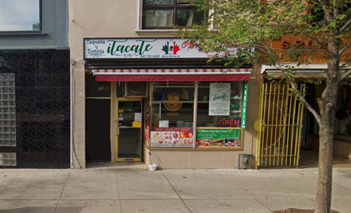
Itacate’s storefront inspired the app’s design direction, capturing its approachable, community-driven spirit.
Approach
The design approach balanced human-centred UX methods with visual storytelling rooted in culture. The goal was to make ordering faster and simpler while maintaining a sense of warmth, familiarity, and authenticity that reflected Itacate’s real-world presence.
1. Research and InsightsA comparative review of major delivery platforms revealed cluttered layouts, limited bilingual accessibility, and minimal cultural personality. Competing apps often relied on generic food imagery and inconsistent user flows, which created confusion and reduced trust.
This analysis presented an opportunity to design a streamlined, brand-owned experience that could retain customer loyalty while eliminating unnecessary third-party fees.
2. Competitive AuditA focused audit was conducted on nearby Latin American restaurants offering digital ordering or delivery. The analysis revealed that while competitors excelled in food quality and service speed, few offered accessible bilingual interfaces or cohesive digital branding.
Key findings:
-
Authenticity and warmth were not fully reflected in their apps or websites
-
Menu navigation often lacked clear translations or filtering
-
Over reliance on Uber Eats, SkipTheDishes, and DoorDash limited customer relationships
View the complete audit in the embedded report.
3. User Personas and StoriesTwo main personas guided the process:
-
Busy Commuters, focused on speed and convenience
-
Local Families, motivated by culture and shared experiences
Each persona highlighted opportunities for accessibility, emotional connection, and efficiency, influencing tone, colour, and navigation design decisions.
4. Journey MappingA visual journey map outlined the path from menu discovery to order confirmation, identifying moments of delight and potential friction points. This process ensured a smooth experience for both new users and returning customers.
5. Wireframing and TestingOver 60 frames were created in Figma, progressing from low-fidelity wireframes to interactive prototypes. Iterative usability testing guided refinements in colour contrast, button sizing, and language toggling, ensuring a comfortable and accessible experience across all devices.
Tools and Methods: Figma, Google UX Framework, User Personas, Journey Mapping, and Competitive Audit Documentation.
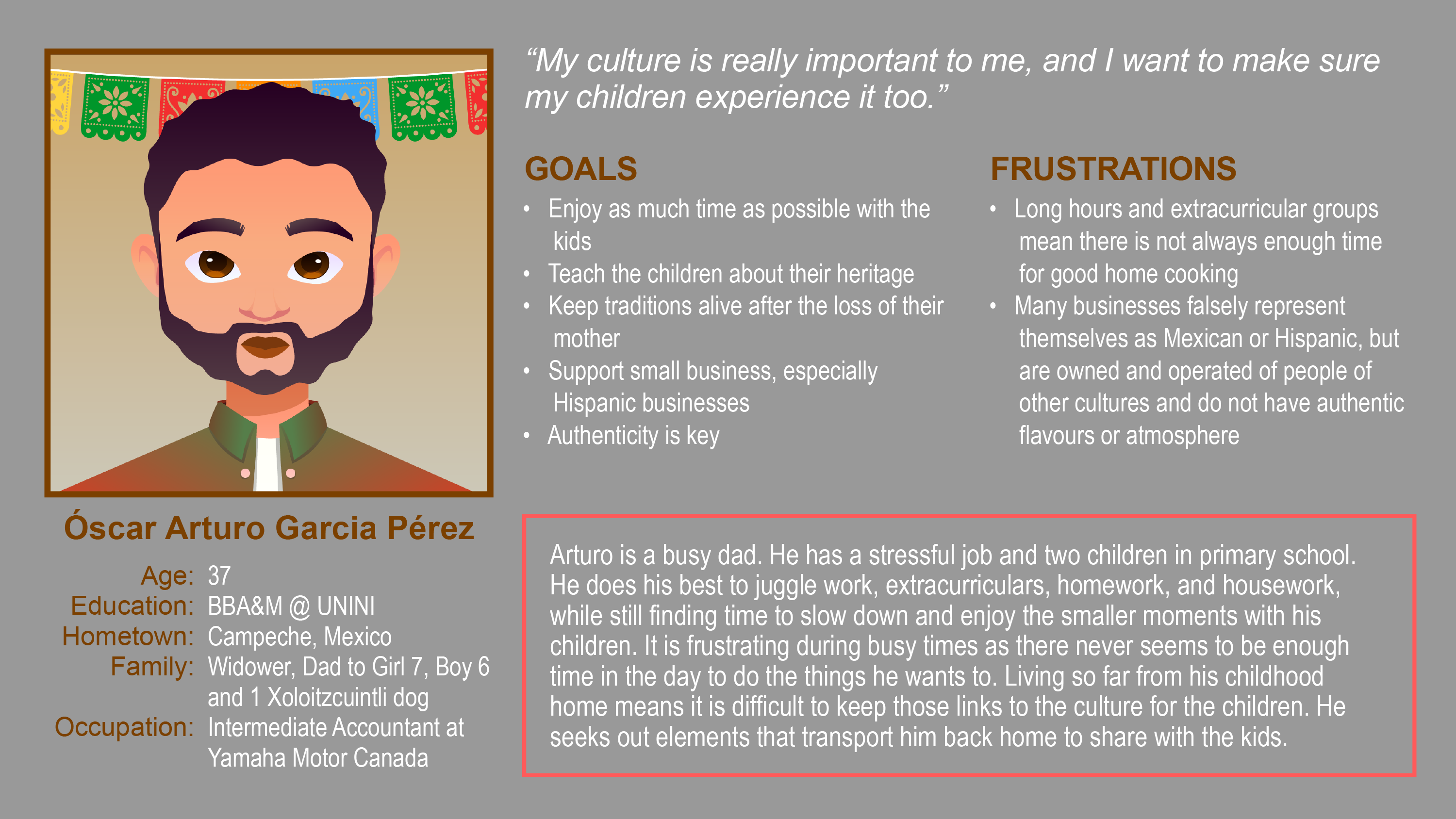
User persona representing cultural authenticity and family-centred motivation.
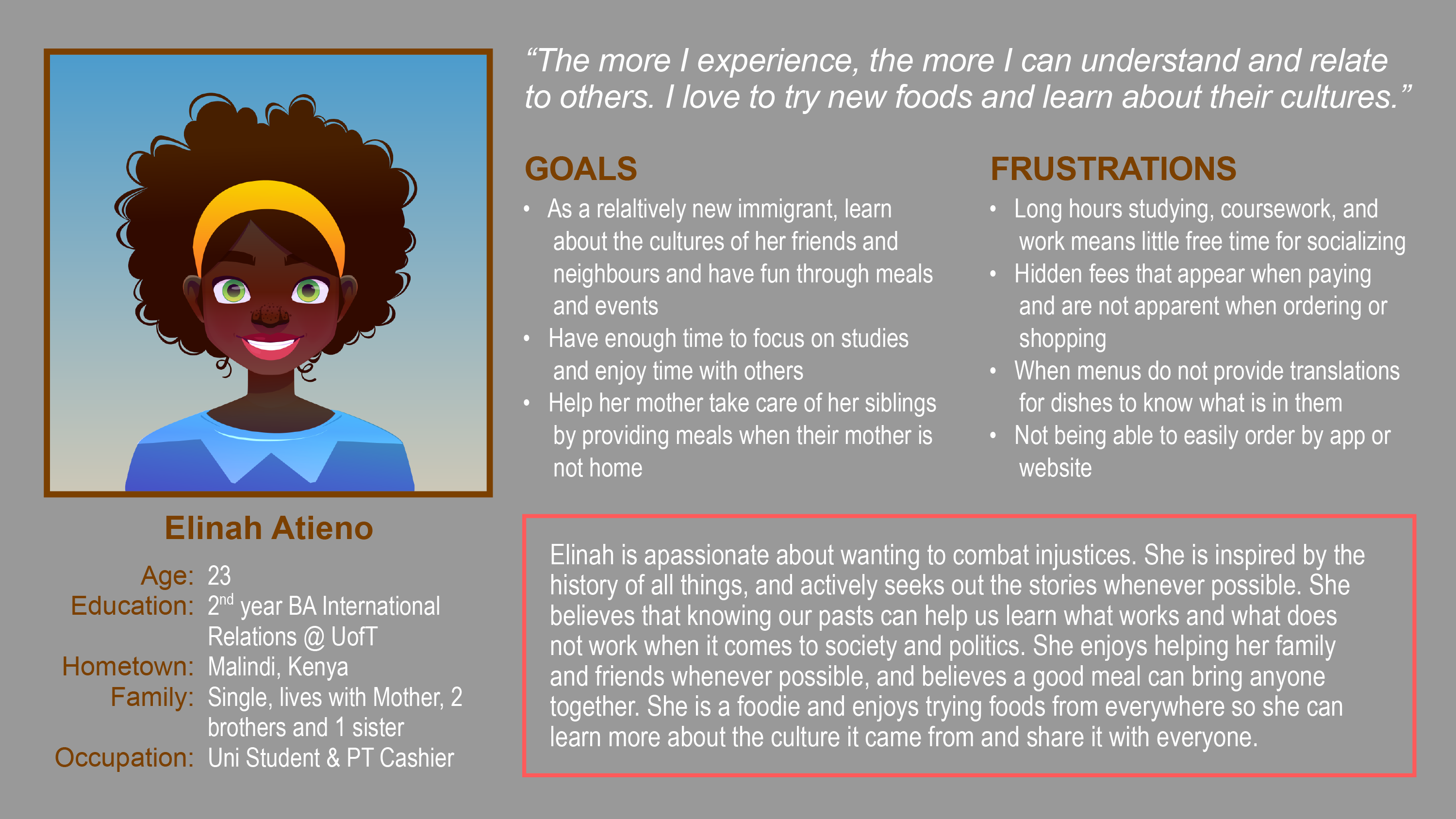
User persona representing curiosity, cultural exploration, and convenience-focused design needs.
Two primary user profiles guided the design process: a family-focused professional seeking authentic connection, and a student eager to explore diverse cuisines.
Result
The final prototype delivered a clean, culturally resonant, and mobile first experience that reflected Itacate’s personality while streamlining the ordering process.
The interface used simple navigation patterns with a warm, appetising colour palette, and subtle iconography inspired by traditional design motifs.
Design Highlights:
Rich red and golden tones inspired by authentic Mexican ingredients
Poppins typography for legibility and approachability
Clear button hierarchy and accessible spacing
Consistent bilingual support with natural transitions
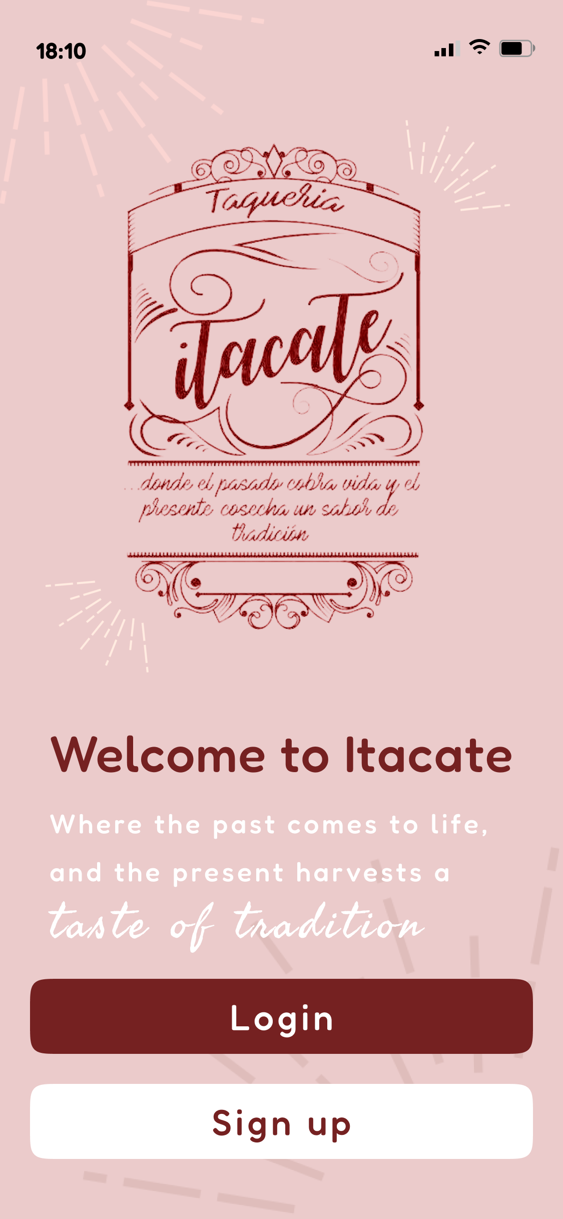
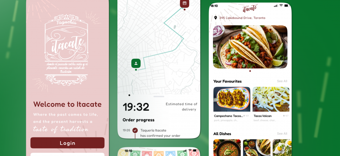
Splash screen of the Itacate app, introducing the brand and login options in a warm, traditional design style.
Project Highlights
Every stage of Itacate’s design process offered a chance to balance usability with cultural identity.
This project stood out for its authenticity, translating the taquería’s welcoming atmosphere into a digital experience that still felt handmade and personal.
A key success was maintaining visual trust, ensuring the app looked genuine, familiar, and community driven. The bilingual layout introduced design challenges that led to a flexible, language aware interface.
The mobile only focus helped maintain a realistic workflow centred on accessibility and thumb friendly navigation.
Overall, Itacate became a clear example of how UX and UI design can help small businesses build independence while staying true to their story.
A seamless bilingual ordering experience that reflects the warmth of a local taquería, adapting to the user’s device language in English or Spanish and allowing adjustments in the app settings for personal preference.
Outcomes & Metrics
Testing and refinement confirmed the prototype’s strength in usability, accessibility, and visual storytelling.
Participants described the experience as simple, fast, and true to the taquería’s personality.
Average test checkout time
< 40 seconds
Visual system adherence
100% to established design language
Navigation error rate
0%
Completion
On time (45 hours)
Closing Summary
Itacate demonstrates how thoughtful UX and UI design can help small restaurants take control of their online presence without losing authenticity.
By combining research, empathy, and practical design, the prototype created a model for culturally rooted, independent ordering systems that strengthen both brand and customer connection.
Ready to Build Something Delicious?
If this project made you hungry for better design, let’s create something with flavour and purpose.
Whether it’s a new brand identity, UX concept, or full product design, we’re always excited to help ideas come to life with clarity and heart.