A Platform with Purpose:
The PACE Canada Redesign
A modern WordPress build for a long-standing charity, designed for clarity, trust, and action.
UX/UI Design · Accessibility + AODA · Web Development · Visual Design

Overview
PACE Canada is a long-standing non-profit dedicated to improving early childhood education and community development in Jamaica. They needed a website that could clearly communicate their mission, make information easier to find, and simplify the donation process. Our goal was to build a warm, trustworthy online presence that balanced professionalism with approachability, ensuring every visitor could connect with the cause in just a few clicks.
Challenge
The previous website had grown organically over the years, resulting in an inconsistent structure and hard-to-find information. Visitors often struggled to locate programmes, events, or donation options, and the site wasn’t fully accessible or mobile-friendly. PACE wanted a refresh that reflected their credibility and made it easier for people to get involved.

Legacy layout before redesign: inconsistent hierarchy and navigation flow.
Approach
We began by mapping core user paths: Donate, Programs, and About Us, to create intuitive navigation and consistent page layouts. Using WordPress with Elementor and Blocksy, we built modular components that the PACE team could update independently. The design focused on warmth and clarity, supported by a calm palette and accessible typography that aligns with AODA guidelines.
The initial palette was the result of extensive research into colour psychology and its use in early-childhood and charitable organisations. Orange was chosen to pair with the client’s established teal, as it conveyed warmth, friendliness, and optimism while offering strong contrast and emotional balance.
Midway through the project, the client shared that both orange and green carried political associations in Jamaica. With much of the design already in progress, this required a fast but strategic pivot. After confirming that primary colours would avoid similar concerns, I developed a new system centred on the existing teal, supported by a lighter golden yellow, a mid red, and a warm mid-deep blue, with light, mid, and dark greys for accessibility and contrast.
The recolouring process affected nearly half of the pages and required recalibrating contrast, hierarchy, and imagery. The result was a palette that remained approachable and vibrant while respecting cultural context and preserving visual clarity.

Initial design direction explored warmth and contrast, later refined for accessibility and brand clarity.

The colour palette evolved mid-project after discovering that certain hues carried unintended associations. The refined direction preserved brand consistency while enhancing cultural sensitivity and accessibility.
Result
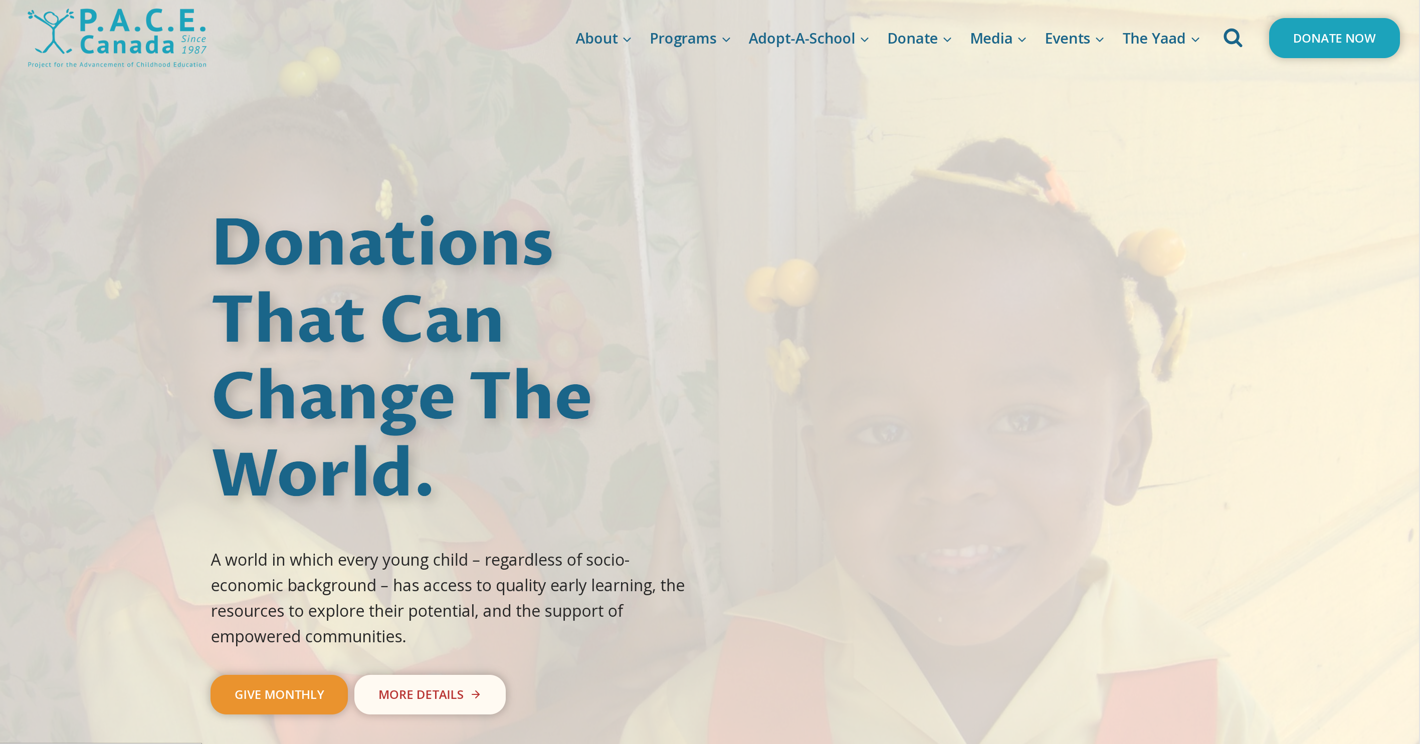
The redesigned site offers clear entry points for donors, volunteers, and educators. Information is presented in concise sections with strong visual hierarchy, while new event and donation modules help users take action quickly. The result is a cohesive, maintainable platform that improves usability, readability, and community engagement.

Final launch homepage with improved content hierarchy and clear donation pathways.
Project Highlights
The redesigned site created clear, intuitive entry points for donors, volunteers, and educators. Content is presented in concise, mobile-friendly sections with strong visual hierarchy. New modules for events, donations, and campaigns help users take action quickly, while improved accessibility ensures that every visitor can connect with PACE Canada’s mission.
Each page reflects a balance of warmth, clarity, and functionality, from community-focused resources like The Yaad and Pickney Place to structured donor experiences that make giving simple and rewarding.

The refreshed About section offers a transparent view of PACE Canada’s history and leadership, balancing storytelling with clarity.

A mobile-first donation flow encouraging quick engagement through concise messaging and clear calls to action.

The Yaad serves as a digital community hub for parents and educators, featuring quick links, learning tools, and family resources in an accessible layout.

Pickney Place brings a playful yet practical mobile experience for families, written in local voice and designed for easy reading on small screens.
Outcomes & Metrics
The new PACE Canada website launched successfully recently, marking a significant step forward in accessibility and clarity for the organisation. The refreshed design has already improved ease of navigation and content management, allowing visitors and staff to find what they need quickly. Built for longevity, the site now provides a solid foundation that can grow with the charity’s evolving needs.
32+ Pages
Custom-designed layouts across main sections and subpages, each optimised for readability and structure
Streamlined Navigation
Simplified site structure that helps visitors reach events, donations, and programmes faster
AODA Compliant
Fully aligned with accessibility standards, ensuring inclusive access for all users
Easy Content Updates
Modular WordPress components empower the PACE team to manage content independently
Early Metrics
Within the first six weeks of launch, the redesigned site welcomed over 1.4K visitors from more than 10 countries, with particularly strong engagement from Canada, Jamaica, and the United States.
Organic search accounted for the majority of traffic, driving nearly 1,000 sessions, a strong indicator of improved visibility and SEO performance.
Average engagement time: 45 seconds per visitor (indicative of streamlined content and clear navigation)
Top-performing pages: Home, Project for the Future, and Choose a Campaign
New users: 100% of traffic to date


Early analytics highlight strong organic reach, cross-regional visibility, and audience growth post-launch (Aug–Oct 2025).
"It has been a pleasure to work with you (Cai & Co.) and to see the significant UI design and changes that you have implemented. You not only improved the user experience but also added some new content for us, and we really appreciate the extra effort. "
Need a website that connects people to your cause?
Let’s design something that makes clarity, trust, and accessibility part of your brand’s DNA.


